
COLLECTING AND CODING THE DATA
Collecting the data
One of the key innovations of our application was the collection and synthesis of diverse data including quantitative and qualitative data. Despite the growing number of studies in using system dynamics for the analysis of qualitative data, system dynamics are predominantly used in quantitative subjects since the ultimate goal is to create a model that allows simulations of scenarios. However, if the aim is to gain an in-depth understanding of the complexity of a system, it is vital to draw on in-depth qualitative data. This though implies that a simulation model may not be feasible. However, the model is not the end result of this exercise, but rather the process of learning about the problem and its complexity (see ‘critical reflections’ section for more information on this issue).
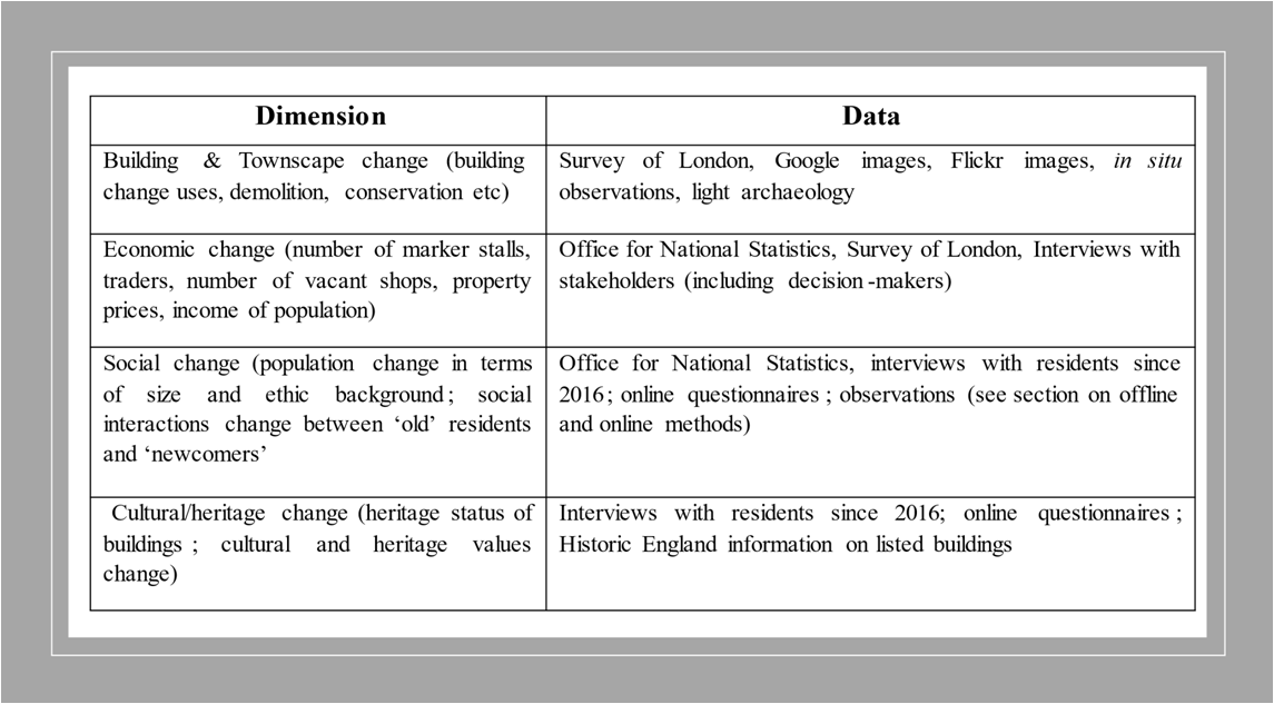
For the case study of Woolwich we drew on a diverse range of longitudinal data as illustrated in the Table below.
Coding the data
The coding process of the data was driven by the aim to categorize the data in ‘cause’ and ‘effect’ relationships. This can be done in two ways. A thematic analysis (that is identifying themes and classifying them into categories) can be performed using the Nvivo software for qualitative analysis (see Figure 1 below). The themes are then depicted in the form of ‘cause’ and ‘effect’ relationships (see Figure 2 below). The relationships can be ‘balancing’ (that is that they are juxtaposing to each other) or ‘reinforcing’ (that is that the ‘cause’ variable reinforces the ‘effect’). Given that the Nvivo is a software that is not openly accessible, for the Woolwich case study we mapped the ‘cause’ and ‘effect’ relationships on Word and Excel as explained below.
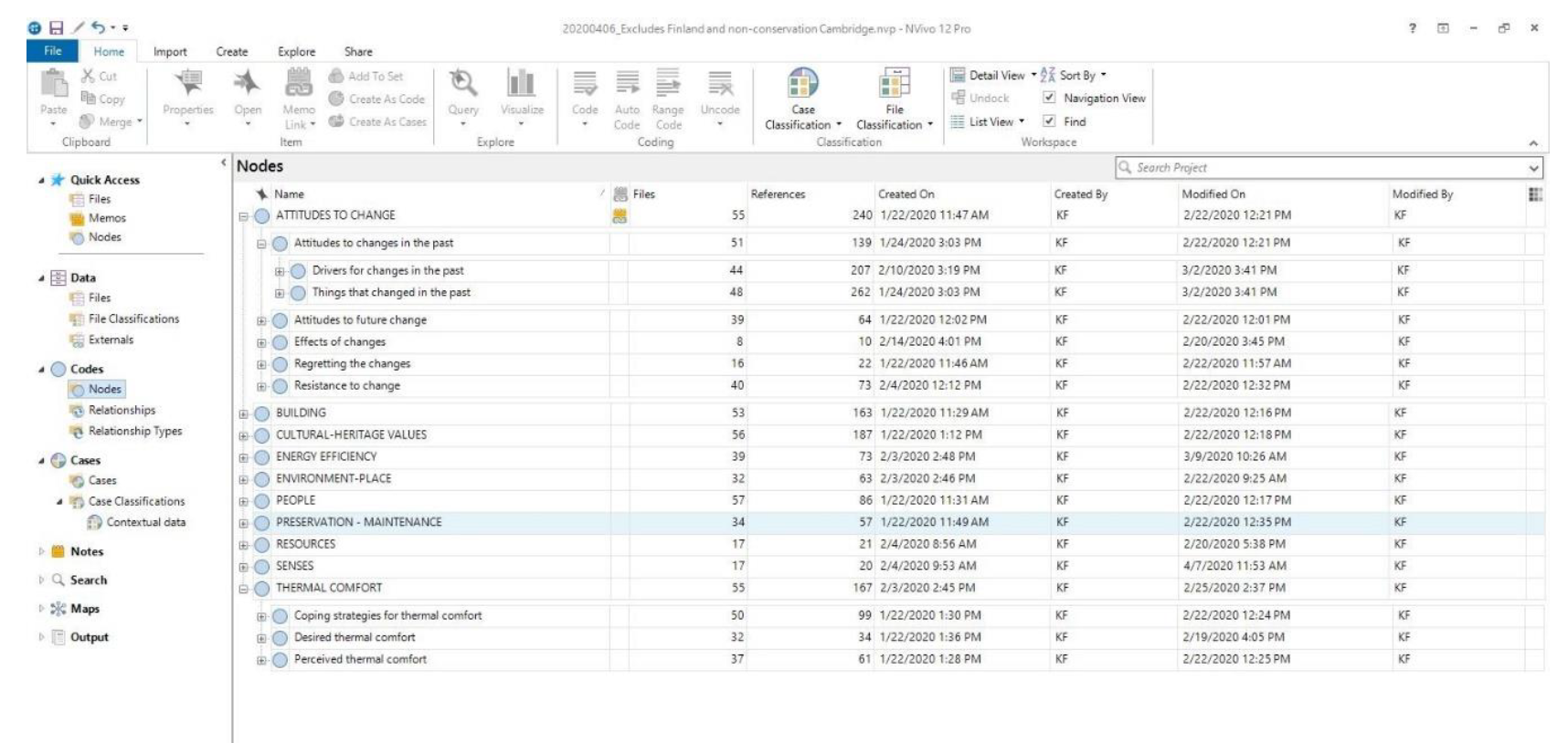
Figure 1: This is a snapshot of thematic analysis performed by Fouseki et al. 2020 (see Further Readings Section) as part of a study exploring the dynamics of residents’ decision-making on heritage conservation, thermal comfort and energy efficiency
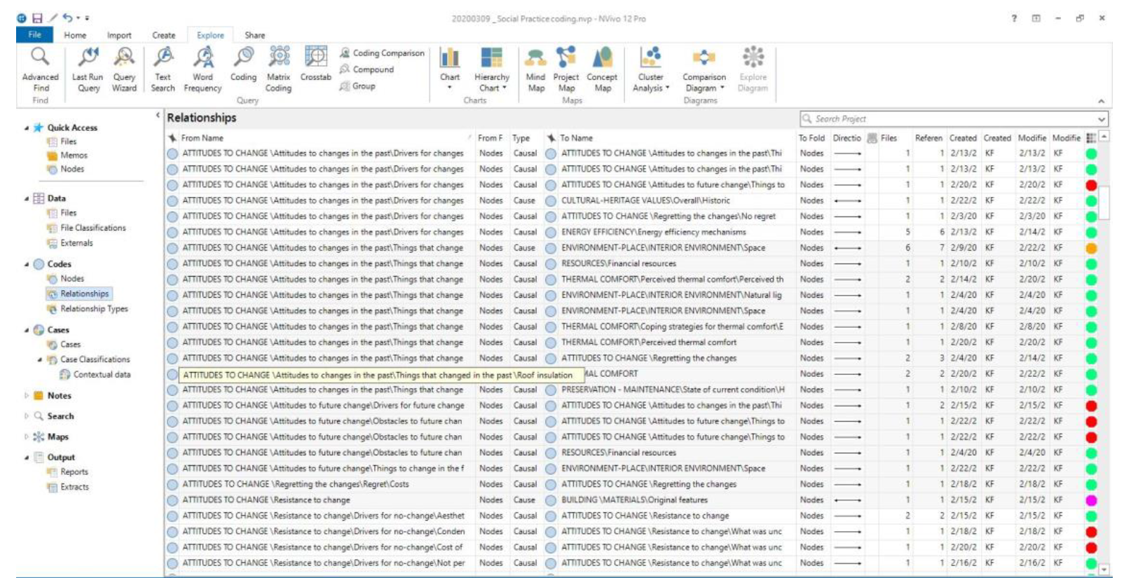
Figure 2: This is a snapshot of cause and effect relationships mapped on Nvivo by Fouseki et al. 2020 (see Further Readings Section) as part of a study exploring the dynamics of residents’ decision-making on heritage conservation, thermal comfort and energy efficiency
In the interview extract below, the thematic analysis into ‘cause’ and ‘effect’ relationships is illustrated.
|
Interviewee 1: Which heritage in Woolwich has changed the most and why? “The market… I remember the market used to go all the way down to the High Street, all the way down, when I was a little kid. It used to go all the way down, the buses used to go up and down the high street, but now it turns into pedestrian access” (Respondent 2018, 12). |
Step 1: Highlight the key words/themes
|
Interviewee 1: Which heritage in Woolwich has changed the most and why? “The market… I remember the market used to go all the way down to the High Street, all the way down, when I was a little kid. It used to go all the way down, the buses used to go up and down the high street, but now it turns into pedestrian access” (Respondent 2018, 12). |
In this sentence, we have two main core themes. The first is ‘how the market used to be in the past’ and ‘how the market is in the present’. The themes can be illustrated as below in the form of a Table.
|
Core themes |
Textual data |
|
How the market used to be in the past |
I remember the market used to go all the way down to the High Street, all the way down, when I was a little kid. It used to go all the way down, the buses used to go up and down the high street (Respondent 2018, 12). |
|
How the market is in the present |
but now it turns into pedestrian access (Respondent 2018, 12). |
For the two core themes, we can identify sub-themes. We will think in terms of ‘cause’ and ‘effects’ for the purpose of the system dynamic analysis. In other words, we will ask the question what led to the thriving of the market in the past and what led to the decline of the market in the present.
|
Core themes |
Sub-themes |
Textual data |
|
How the market used to be in the past |
Factors ‘causes’ that led to the thriving of the market in the past |
I remember the market used to go all the way down to the High Street, all the way down, when I was a little kid. It used to go all the way down, the buses used to go up and down the high street (Respondent 2018, 12). |
|
|
|
I remember the market used to go all the way down to the High Street, all the way down, when I was a little kid. It used to go all the way down(Respondent 2018, 12). |
|
|
|
the buses used to go up and down the high street (Respondent 2018, 12). |
|
How the market is in the present |
Factors ‘causes’ that led to the decline of the market |
but now it turns into pedestrian access (Respondent 2018, 12). |
|
|
|
but now it turns into pedestrian access (Respondent 2018, 12). |
Now that we have identified a few ‘cause’ and ‘effect’ relationships, we can summarize those in the following table as ‘reinforcing’ or ‘balancing’ as per the example below.
|
Cause |
Effect |
Explanation of relationship |
Type of relationship |
|
Connection of the market with the High Street (the more +) |
Market Growth (the more +) |
The more the market is connected to the High Street, the more the market grows |
Reinforcing (+ and +) |
|
Buses coming through the market and High Street (the more +) |
Market Growth (the more +) |
The more the buses are coming through the market, the more the market grows |
Reinforcing (+ and +) |
|
Pedestrianization of Beresford Square and market (the more +) |
Market Growth (the less the market grows -) |
The more the Beresford Square is pedestrianized, the less the market grows |
Balancing (+ and -) |
The ‘cause’ and ‘effect’ relationships can be identified with any type of data, not just interview data. For instance, with the Survey of London data, we were able to map the dynamic transformation of material change (that is building and townscape change) and by doing so we were able to identify some of the ‘causes’ and ‘effect’ relationships. We used Excel for the mapping of this rich historic information (for further information see WP2 Case study report). We chronologically organized the information in the following main phases of development.
- Early construction phase (1798-1830s)
- Growth and revival through transportation and industrialization (1840s-early 1860s)
- Signs of decline due to defence cuts (affecting the Royal Arsenal) (mid 1860s – 1870s)
- Attempts of revival through commercial boosting (shops construction) (1880s – 1902)
- Commercial decline (1903-1960)
- Economic and social decline (coincides with full closure of Royal Arsenal) (1960s-1990s)
- ‘Regeneration’, revival (2000s-today)
We mapped on Excel the following information per year before identifying and drawing the relevant cause and effect relationships.
- Year of change
- Phase of change
- Open spaces: What open spaces existed or were created at specific periods in time?
- What markets were developed, stopped functioning or revived at specific times?
- What ‘threats’ did the area under consideration face over time and what reactions were caused?
- How was the Townscape at specific times? i.e. what was the height of buildings, how did this change etc?
- If you choose a street as the focal point, it would be useful to look at each building separately of the street- what was the first building? what was its original use? Did the use change? If yes, when and how? So far, in Powis street, the main uses have been fulfilled by the buildings include: Religious, public/civic buildings (i.e. police stations, colleges), shops/commercial, residential, offices, mixed use (combined shops with offices and residences). More uses may be identified in due course as the research progresses.
- Material: How did each structure change? Was it renovated, expanded, demolished at what period of time?
- Population size change: What was the population at different periods of time?
- Population age change
- Population ethnicity change
- Employability
- Number of vacant businesses
- Number of cultural centres/buildings: when did they open; when they did they close
- Sense of well-being and communities among residents
- Images from the past
- Images from the present
- Stories/memories from blogs etc from the past
- Stories/memories from the present
- Date of designation/listing if a building has been designated
- Contestation if any conflict emerged at specific times
- Actions (things to do next)
- Other complementary notes
Last update
12.12.2022